Svelte Simple Datatables
This guide will show you how to create a
<Datatable />
component with
Svelte Simple Datatables
and style it with Skeleton's Tailwind classes.
Svelte Simple Datatables (SSD) is a headless library for creating datatable components with Svelte. It provides an API to dynamically interact with iterable data on the client-side to filter, paginate, sort, and select data. It can handle server-side data processing, supports Typescript, and has no dependencies.
Introduction
We will use SSD to create a
<Datatable />
from a native HTML
<table>
which we can then style with Skeleton's
native HTML table styles.
We will then create accessory components to search, filter, sort, and paginate the
<Datatable />.
You can start fresh with the starter template provided below or continue on and follow the guide to create your own components from scratch.
Starter Template
If you're looking for a quick start or reference project, please refer to our opinionated template on GitHub.
Getting Started
Install SSD
Add SSD to your Skeleton Sveltekit project by running the command below.
npm i -D @vincjo/datatablesProject Structure
Create the following files in your project.
src
├── lib
|	├── data
|	|	└── data.ts / api.ts
|	└── components
|	    ├── Pagination.svelte
|	    ├── Search.svelte
|	    ├── RowCount.svelte
|	    ├── RowsPerPage.svelte
|	    ├── ThFilter.svelte
|	    └── ThSort.svelte
└── routes
	├── Datatable.svelte
└── +page.svelte/lib/data- Create
data.tsif you are loading data from the client orapi.tsif your data is coming from the server. This will be explained further on, but for now just create the blank Typescript file. /lib/components- All of the files in this directory will be used for accessory components.
/routes/Datatable.svelte- This file will contain the
<Datatable />component, the associated logic, and render the accessory components. /routes/+page.svelte- This is where we'll render and access the
<Datatable />component in this example.
Creating the Components
Your components will need to be configured slightly differently depending on whether the data is coming from the server or the client. You can toggle between the two guides below.
Client
1. Loading Data
Let's add some fake data to the data.ts file.
The full dataset can be found here, under the data tab.
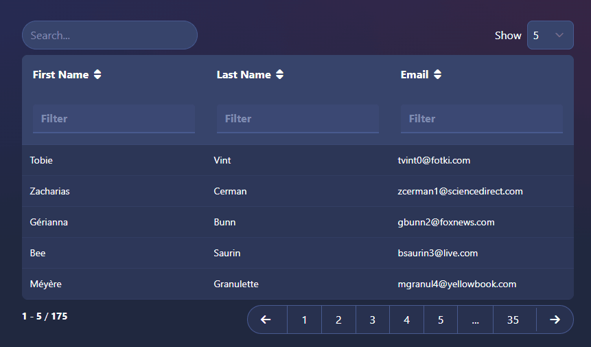
export default [
	{ id: 1, first_name: 'Tobie', last_name: 'Vint', email: 'tvint0@fotki.com' },
	{ id: 2, first_name: 'Zacharias', last_name: 'Cerman', email: 'zcerman1@sciencedirect.com' },
	{ id: 3, first_name: 'Gérianna', last_name: 'Bunn', email: 'gbunn2@foxnews.com' },
	{ id: 4, first_name: 'Bee', last_name: 'Saurin', email: 'bsaurin3@live.com' },
	{ id: 5, first_name: 'Méyère', last_name: 'Granulette', email: 'mgranul4@yellowbook.com' }
	// ...
];
2. Setup SSD
In the Datatable.svelte file, add the imports for your data and DataHandler from SSD,
then initialize handler and rows.
import data from '$lib/data/data';

import { DataHandler } from '@vincjo/datatables';

const handler = new DataHandler(data, { rowsPerPage: 5 });
const rows = handler.getRows();
Configure the markup to match your dataset.
<div class="overflow-x-auto space-y-2">
<table class="table table-hover table-compact w-full table-auto">
<thead>
<tr>
<td>First name</td>
<td>Last name</td>
<td>Email</td>
</tr>
</thead>
<tbody>
{#each $rows as row}
<tr>
<td>{row.first_name}</td>
<td>{row.last_name}</td>
<td>{row.email}</td>
</tr>
{/each}
</tbody>
</table>
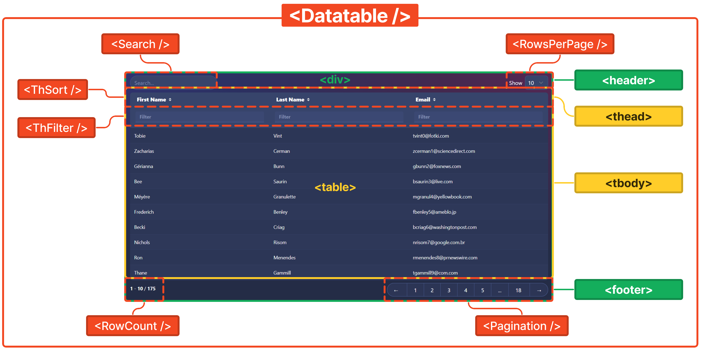
</div>3. Add Accessory Components
You can modify the configuration
of the accessory components to your liking by adding or removing them from the
<header>,
<footer>, and
<thead>.
import Search from '$lib/components/Search.svelte';
import ThFilter from '$lib/components/ThFilter.svelte';
import ThSort from '$lib/components/ThSort.svelte';
import RowCount from '$lib/components/RowCount.svelte';
import RowsPerPage from '$lib/components/RowsPerPage.svelte';
import Pagination from '$lib/components/Pagination.svelte';<div class=" overflow-x-auto space-y-2">
<header class="flex justify-between">
<!-- <Search {handler} /> -->
<!-- <RowsPerPage {handler} /> -->
</header>
<table class="table table-hover table-compact w-full table-auto">
<thead>
<tr>
<!-- <ThSort {handler} orderBy="first_name">First name</ThSort>
<ThSort {handler} orderBy="last_name">Last name</ThSort>
<ThSort {handler} orderBy="email">Email</ThSort> -->
</tr>
<tr>
<!-- <ThFilter {handler} filterBy="first_name" />
<ThFilter {handler} filterBy="last_name" />
<ThFilter {handler} filterBy="email" /> -->
</tr>
</thead>
<tbody>
{#each $rows as row}
<tr>
<td>{row.first_name}</td>
<td>{row.last_name}</td>
<td>{row.email}</td>
</tr>
{/each}
</tbody>
</table>
<footer class="flex justify-between">
<!-- <RowCount {handler} /> -->
<!-- <Pagination {handler} /> -->
</footer>
</div>You can find the code for each accessory component at the link below.
4. Import Datatable Component
Call your new <Datatable /> component into +page.svelte and you are good to go!
import Datatable from './Datatable.svelte';<Datatable />You can find the code for the final <Datatable /> component at the link below.
Responsive Design
We can use standard responsive web design techniques to make the components display properly on all devices.
The <Datatable />
and accessory components in this example are wrapped up in a single
<div>.
Tailwind classes are then applied as necessary to different elements.
The <Pagination />
component provides an example of how we can apply different UI elements for different screen sizes.
Componentization
To reuse the <Datatable /> component
throughout your app, you can,
- Duplicate the file and update the DataHandler Methods from SSD, or,
- Export the appropriate props and build your own reusable component.